JQuery+CSS实现【返回顶部】按钮,不需要图片
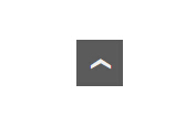
【返回顶部】按钮实现起来并不麻烦,有用图片实现的,有用Font Awesome实现的,效果都不错,但是都重了了些。这里我们用JQuery和CSS实现,相对更加轻量,代码也很简单,不需要加载额外的 js 文件。效果如下:
首先,在页面 <body>标签内 任何地方加上下面的HTML节点:
<a href="#" class="scrollup">›</a>
其次,在页面 <head>标签内 加上jquery文件,为方便,可以直接加载百度静态文件中的JQuery:
<script type="text/javascript" src="http://apps.bdimg.com/libs/jquery/1.11.3/jquery.min.js"></script>
然后,在页面 <head>标签内 加上下面的 Javascript 脚本:
<script type="text/javascript">
    (function ($) {
        $(document).ready(function () {
            // Fade In and Out when Scroll
            $(window).scroll(function () {
                if ($(this).scrollTop() > 100) {
                    $('.scrollup').fadeIn();
                } else {
                    $('.scrollup').fadeOut();
                }
            });
            // Scroll to Top
            $('.scrollup').click(function () {
                $("html, body").animate({scrollTop: 0}, 150);
                return false;
            });
        });
    })(jQuery);
</script>
在页面 <head>标签内 加上下面的CSS样式:
<style type="text/css">
/* Scroll to Top */
.scrollup {
    display: none;
    width: 42px;
    height: 42px;
    line-height: 35px;
    position: fixed;
    bottom: 5%;
    right: 5%;
    color: #eee;
    font-size: 40px;
    background: #929292;
    text-align: center;
    text-decoration: none;
    transform: rotate(-90deg);/*旋转*/
    -webkit-transform: rotate(-90deg);
    -moz-transform: rotate(-90deg);
    -o-transform: rotate(-90deg);
    opacity:0.85; /*透明*/
    filter:alpha(opacity=85);
/*    writing-mode: tb-rl;*/
    font-family: "Helvetica Neue", "Helvetica", "Arial";
}
.scrollup:hover, .scrollup:focus {
    color: #eee;
    text-decoration: none;
    background: #5b5b5b;
}
</style>
使用的时候,可以按照具体需要调整。
- 要改变按钮大小,可以重新设置 CSS 中 width 和 height 的值,同时调整 line-height 与之对应,使向上箭头水平居中。说明:因为箭头使用 › 反转90度实现,所以 line-height 变为设置水平位置,text-align 变为设置垂直居中。
- 要改变按钮位置,可以重新设置 CSS 中 bottom 和 right 的值。
下一篇: 国内外公共CDN静态资源网站大全